Introduction to Fonts
We’ll talk about fonts. You might think fonts are unnecessary, but I noticed one thing when looking at these amateur game apps: generally, these beginners believe that fonts are unnecessary. So first, let’s see how Construct 3 handles fonts. And then, we’ll look at Google Fonts specifically. So we’ll name Fonts here.

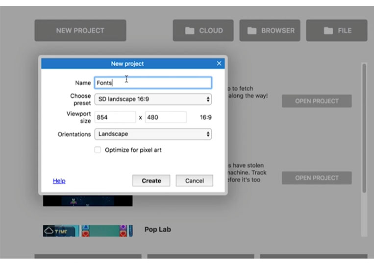
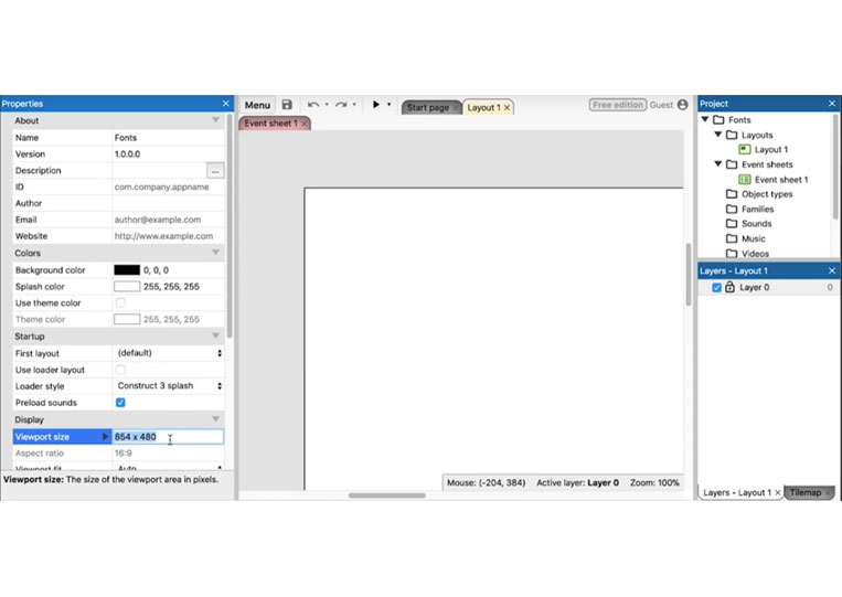
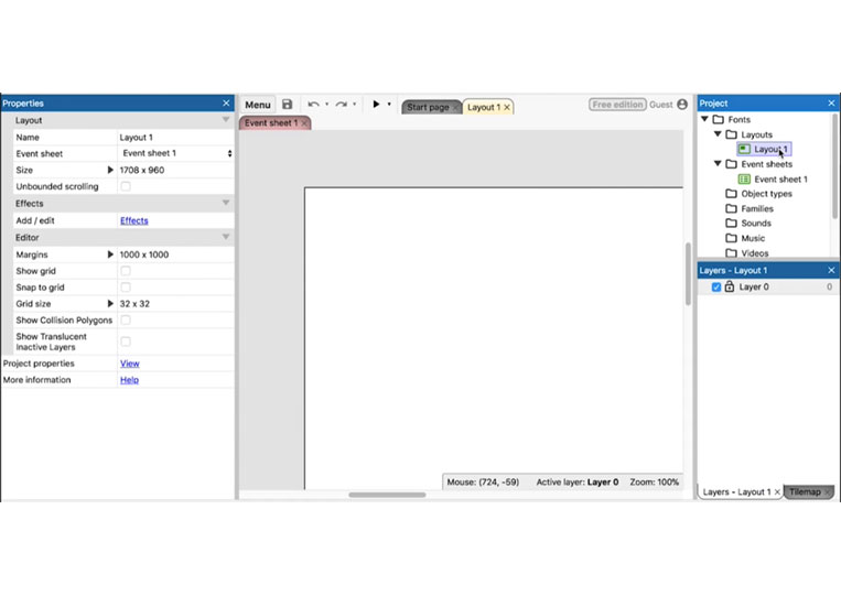
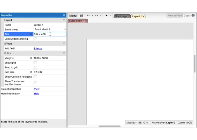
The next thing we will do is change the layout size.
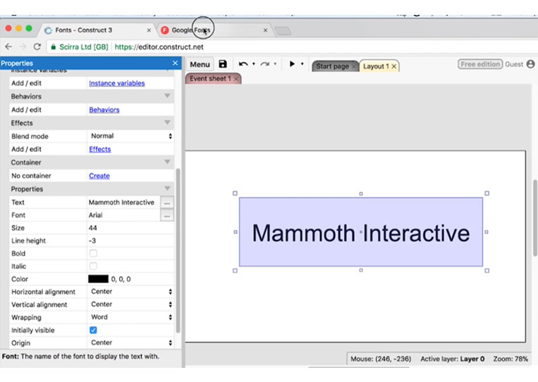
And then, we’ll add some text that is not too complicated.
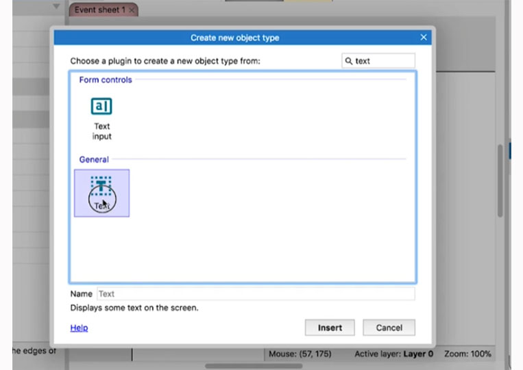
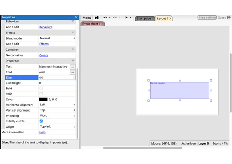
So we can give it some given a name here.
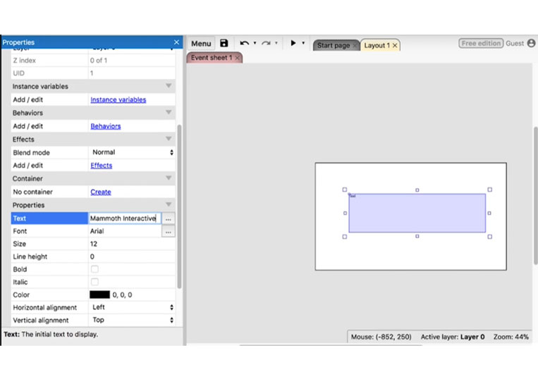
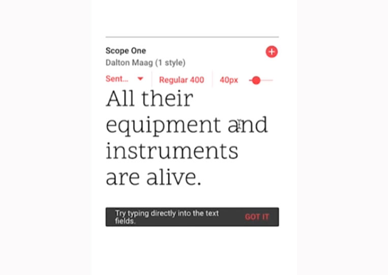
And maybe a font size of 44.
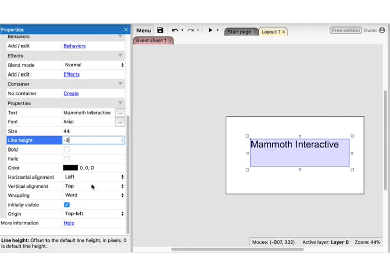
That looks good, and we can make everything centered.
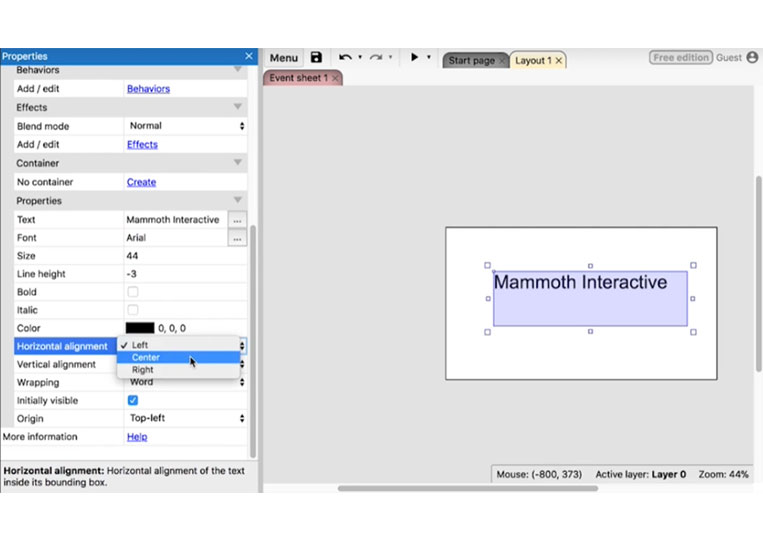
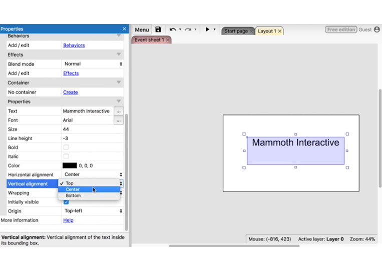
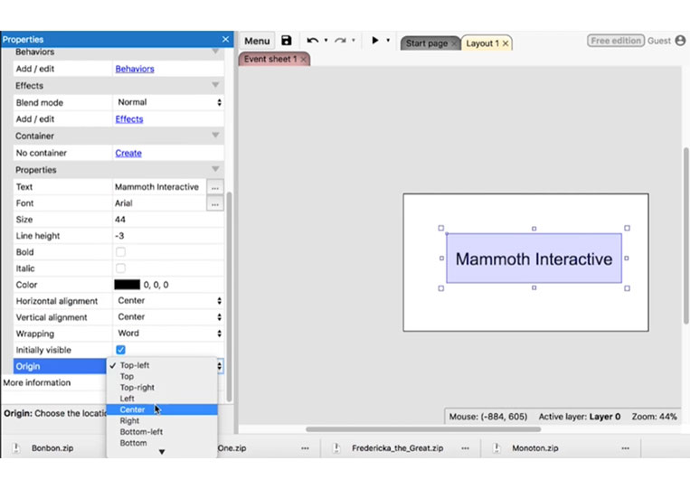
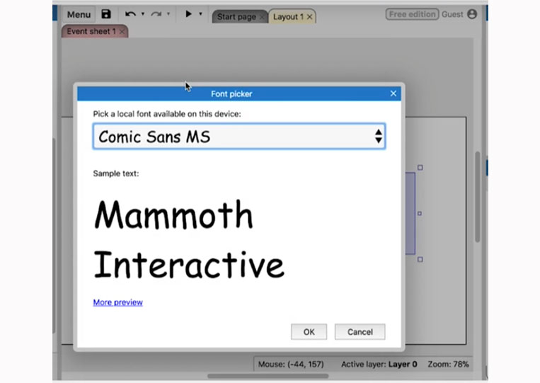
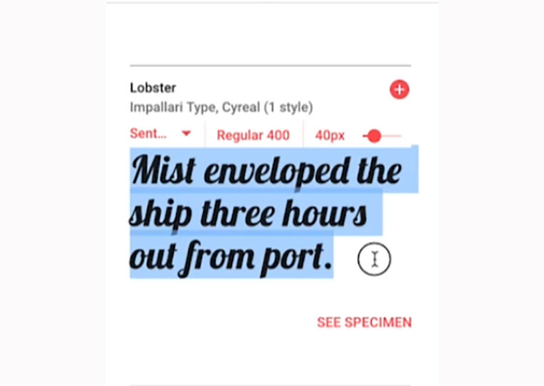
I like my text objects to be centered like this. But this isn’t a tutorial about the text. It’s about the font. So now, let’s click on the font here.
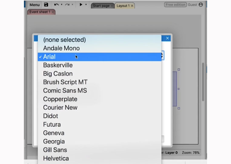
And as you can see, we have all these different fonts—the Comic Sans MS.
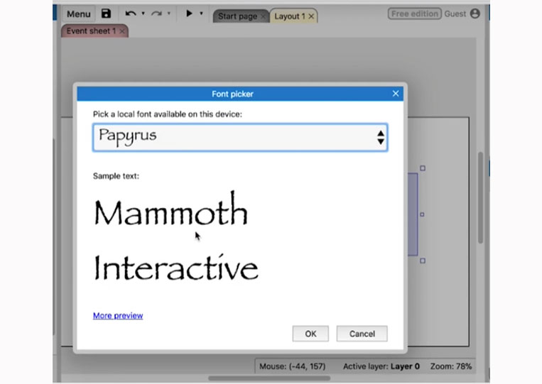
Or Papyrus.
One of my favorite fonts to use is Gill Sans or Futura.
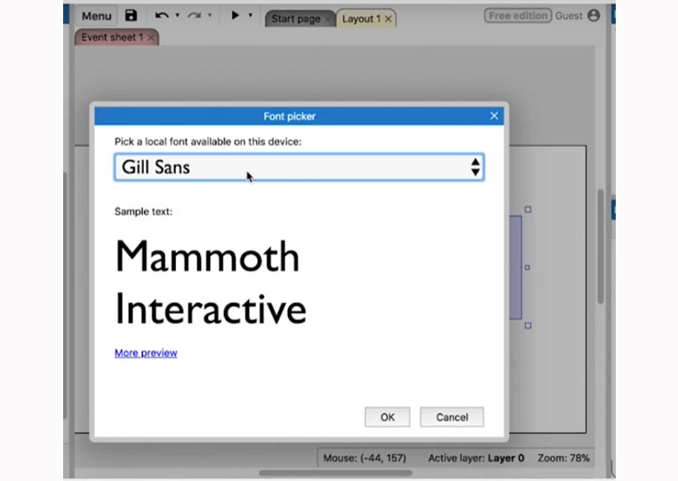
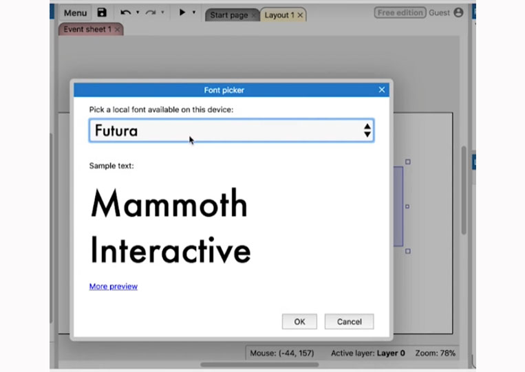
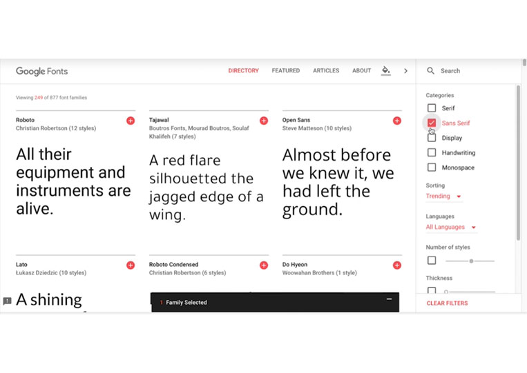
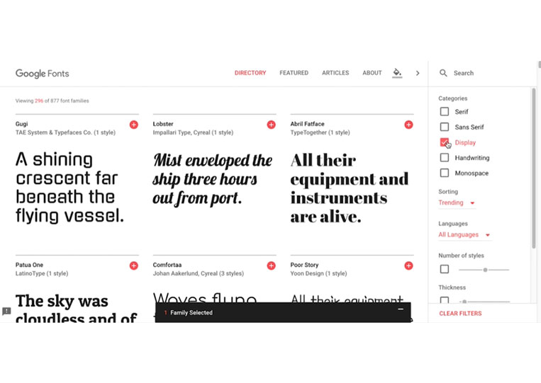
These are both clean and beautiful fonts here. I will give you a small test to see if you should use this Papyrus font. The answer is usually no. And if you don’t notice anything wrong with this font, then this trial is for you, and it’s probably best to follow and listen to this entire tutorial as it’s essential. Now just a brief history of the fonts on the computer. Computers only use Monospace fonts, which are starting to appear shortly. And as a result, the fonts didn’t look too promising until Steve Jobs came along. And since taking a font course in college, he thought computers would be able to render these beautiful fonts in computers. And it wasn’t easy at the time to do this. And, of course, the pompous Steve Jobs said that if he didn’t, the computers would always have the monarch’s face font or something. So, in any event, let’s take a look at Google Fonts here and let’s take a look at the different types here.
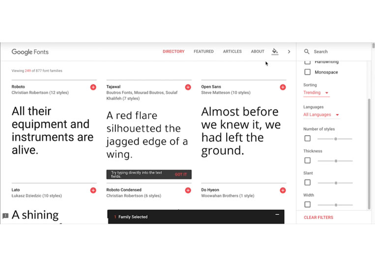
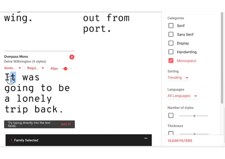
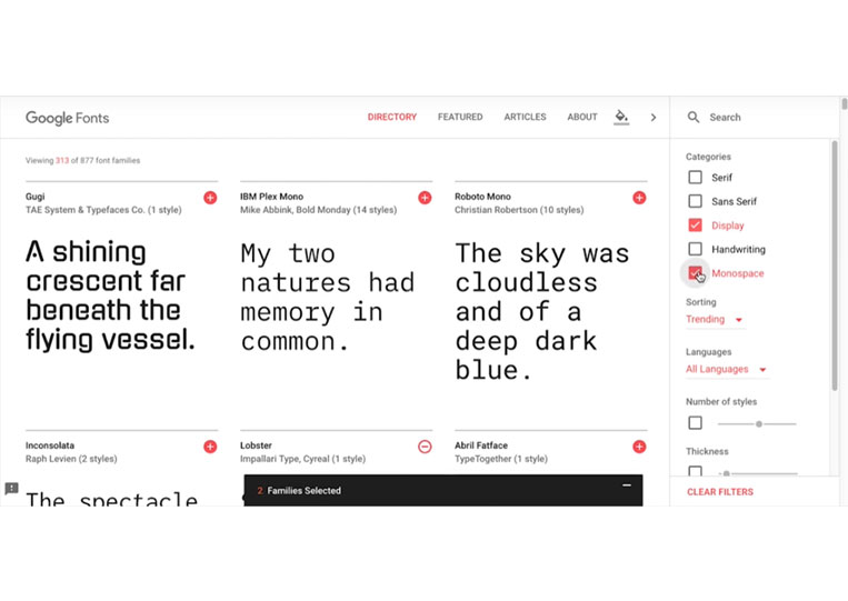
So, if you don’t already know, Google has a ton of great fonts here, and we’re talking Monospace fonts. The mono means one, and space means space.
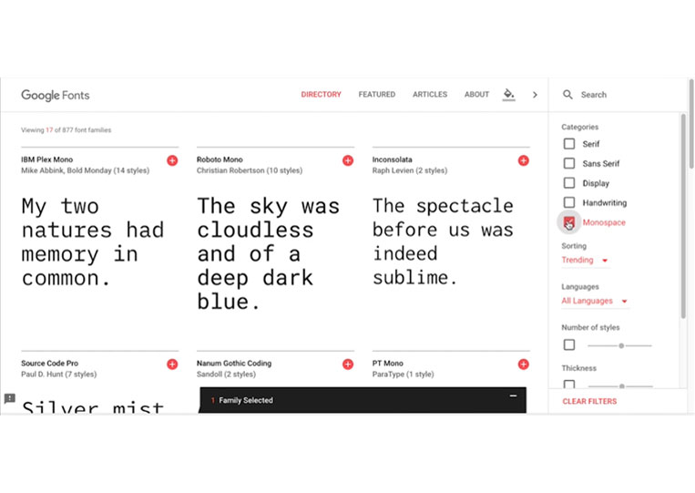
For example, Monospace fonts have only one space per character, whether a Q or a Z. They’re all the same. And as a result, it has more of a retro feel because, at one point, that’s the only thing they can do. That was the only thing that computers could do. Not all of them look old school, but as you can see, the ones generally tend to be square.
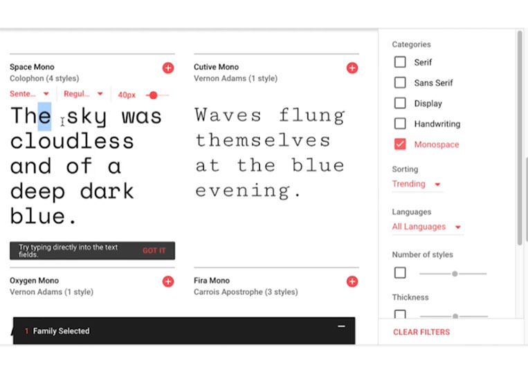
Because Monospace is one space, you can see that when I highlight these two words.
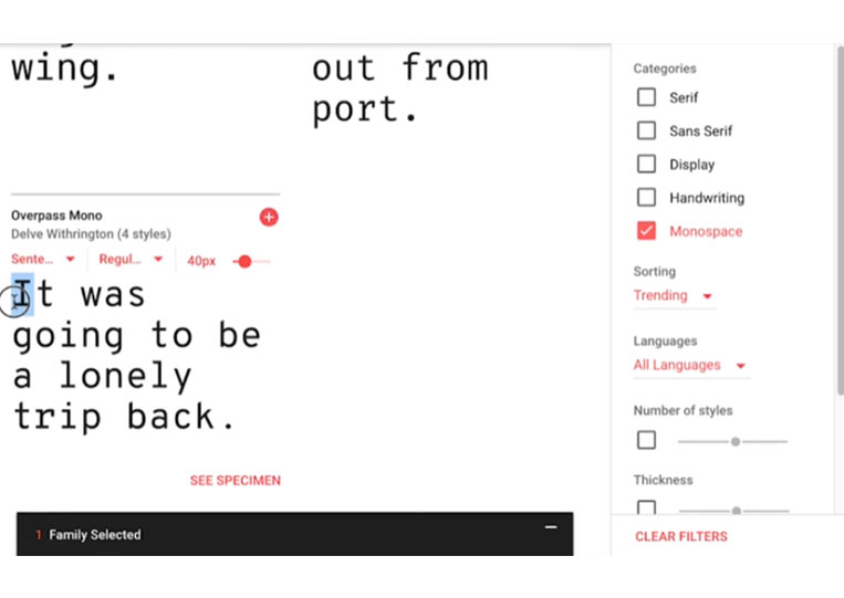
How are these two letters? They’re different lengths, whereas the old-school ones are all boxes. So, in any event, this is what Monospace fonts have been around for the longest. That was the only thing they could do. So let’s take a look at Serif fonts.
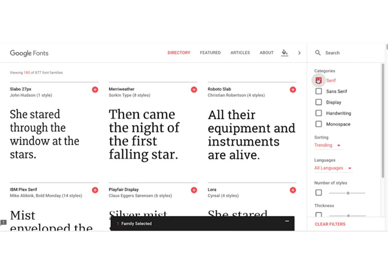
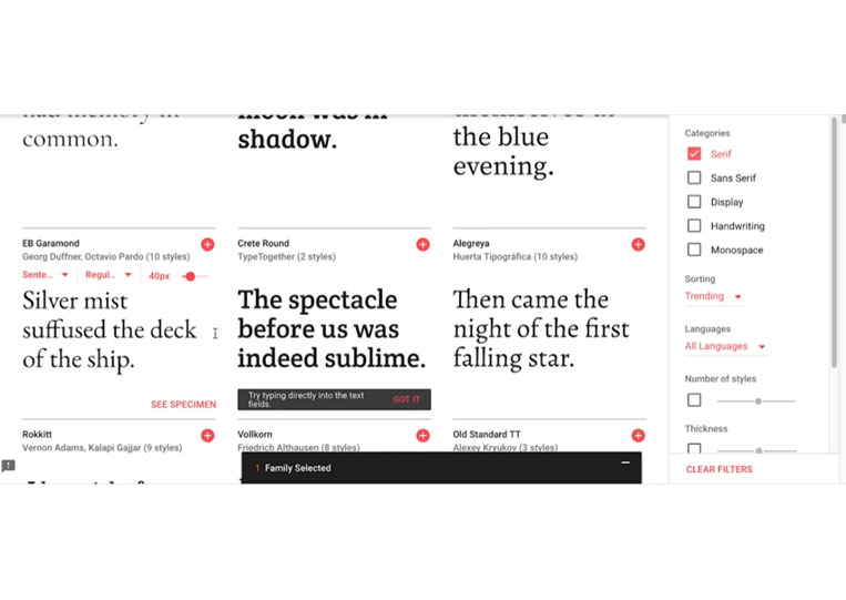
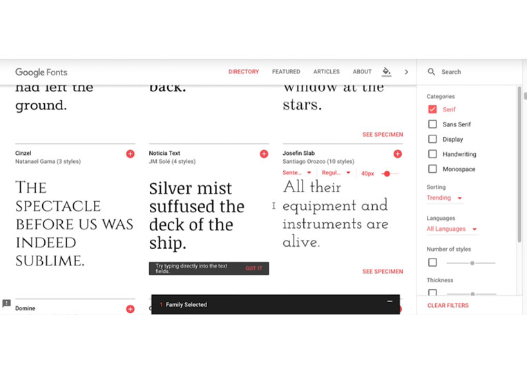
Now Serif fonts if you’ve ever been to Rome or seen Roman writing. They have these lines underneath. And that’s exactly. If I examine heavily, you’ll see that these lines are at the bottom of the words.
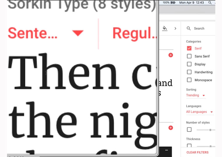
These lines at the bottom, if you can see under the word, little it looks wide. And that helps the eye read. So if you have large bodies of text, it’s best to use Serif fonts. Many newspapers have Serif fonts, and many documents use Serif fonts like this.
Now it’s up to you whether they look good, but they give more than a functional feel because most people use Serif fonts in search of even more visual appeal. And we’ll talk about that in a moment, but as you can see, there are all sorts of different fonts you can choose from, and the thing to keep in mind is that when you create a font and like it, you have to find out how it feels. So if you are making a classic game, you can use them in whitespace font, and you will not use some handwritten font for your classic game because it might clash. Sometimes, you can take something from the opposite end of the spectrum, which complements it in a way you wouldn’t expect. But you have to make sure that it works. And that’s hard to do. There’s no honest technical answer for that. It’s just the way it is. I should note that if you look at these three fonts.
One seems bolder than the other, for instance.
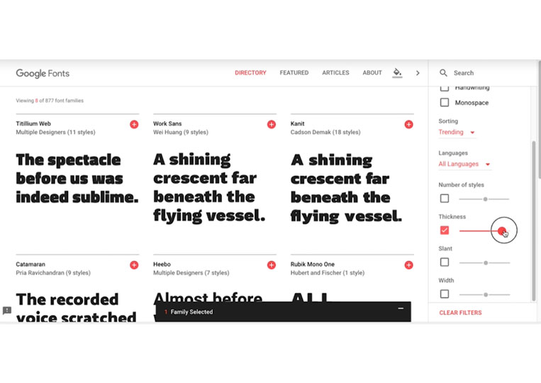
And that’s what people usually call font-weight. And you can click the thickness, and things can get a pretty thick case.
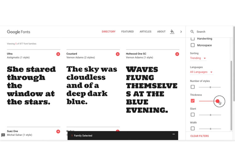
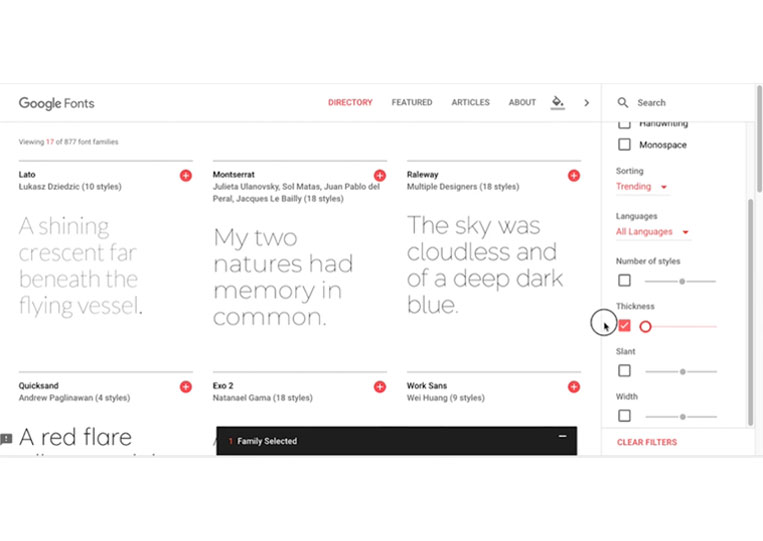
So this is having a large weight, or some people call this a weight thickness. And some have degrees like Bold or Extra Bold. But you don’t want to put large portions of text in this big, bold font. So that is used more for headers. So we have a thin thickness at the other end of the spectrum.
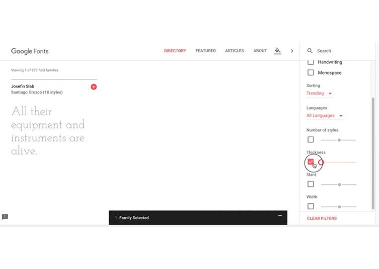
Now, this again looks good in a completely different way. However, you must understand that using thin fonts is not a good experience. And let me explain that. Many people can’t see it, and you don’t want that to happen. You don’t want people with poor vision not to be able to play your game or use your app. A few years ago, there was a movement to make many Internet fonts not have a lot of weight or thin like this. That all looked pretty good. I saw a lot of the Websites. However, not everyone can see these fonts’ cases. Some people have poor vision than others. There is a certain weight that most people see as a significant percentage.
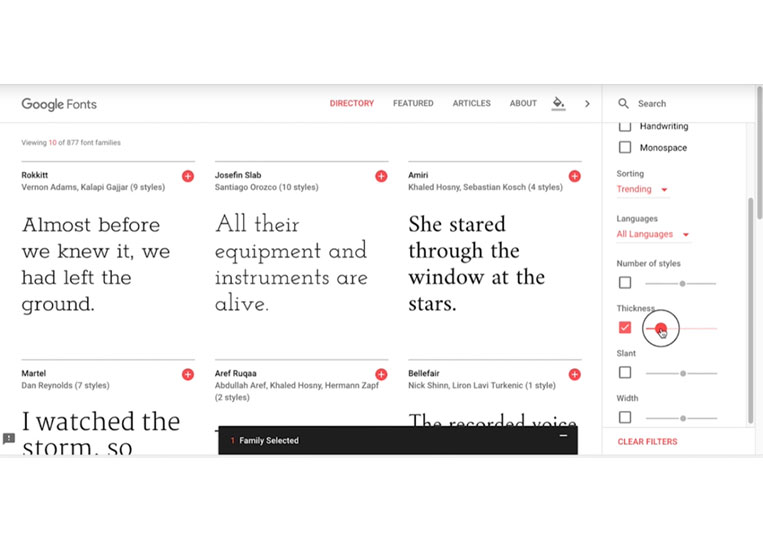
And this is the kind of font everyone can see. So maybe somewhere in this, have a standard weight.
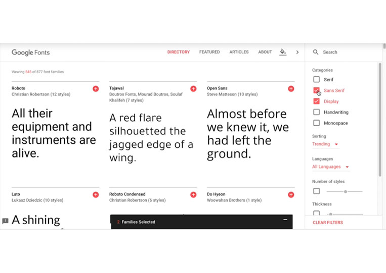
We also have the Sans Serif fonts.
Now, we look at the Open Sans fonts.
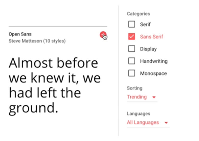
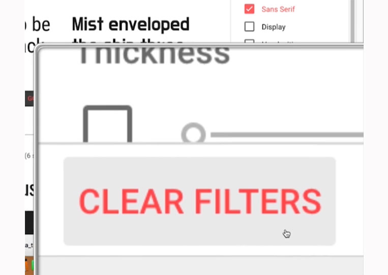
They don’t have small lines below them. And that’s pretty cool. Because they don’t have those lines underneath, they’re a bit harder to read, but before I say that, most of you probably don’t know. So most of what people understand as fonts are these fonts because they look good. And once you start looking at fonts, you’ll see these. So, for example, the cool thing about CLEAR FILTERS is that it lists all uppercase letters.
All these little things are essential. With these Sans Serif fonts, we have something thick.
These are all pretty thick. And we also have more of the thin ones here.
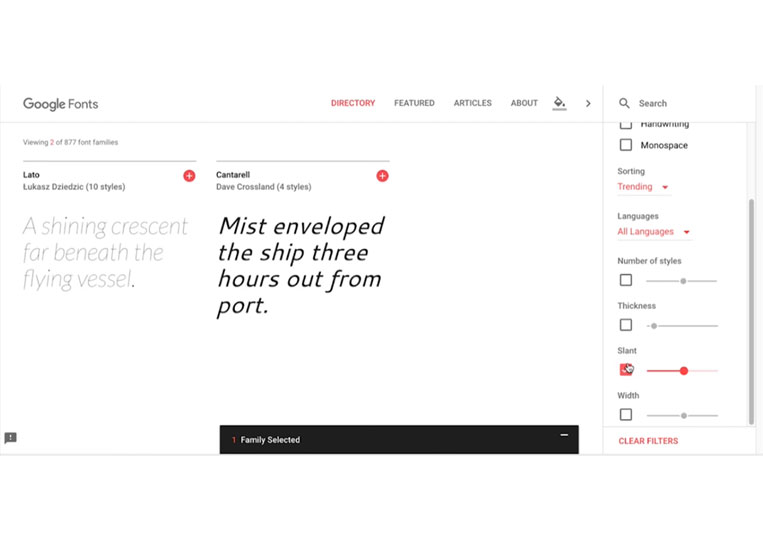
And again, this one’s tough to read. I have no good eyesight and find it just on the edge because I can’t read it. So try not to use that thickness if you can all. You can also check the Slant.
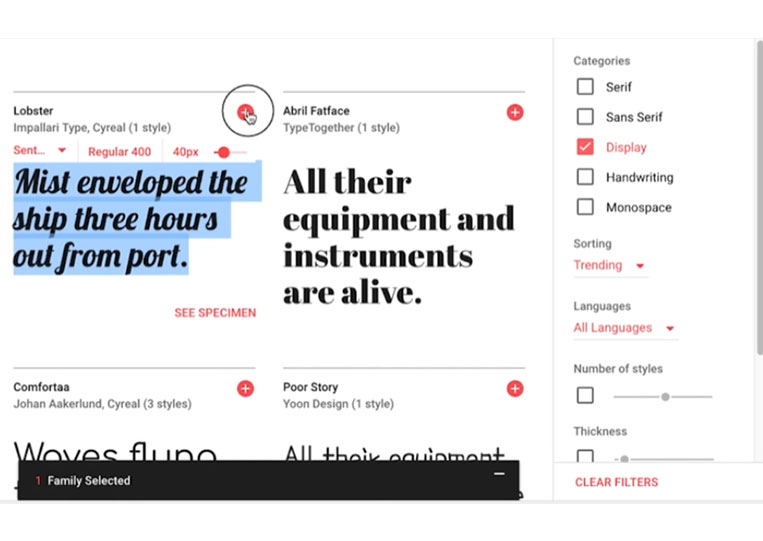
Do you want to do that or not? So Sans Serif fonts are used more because they look better than all the fonts shown on the right. Now, the Display fonts are mainly used for headings.
You won’t want to read entire paragraphs with this font.
It just won’t look good. You can try it. Grab a large text document and download a few cool fonts.
I’ve done this, and I’ll put them in the context of another story. You see, here.
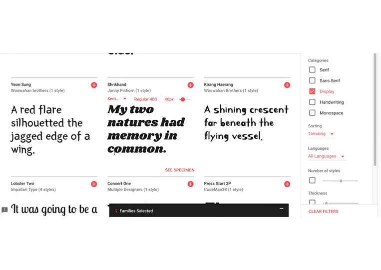
These fonts are better for headings. However, they are not suitable for four paragraphs. So keep that in mind. For example, would you want to look at a whole section like this?
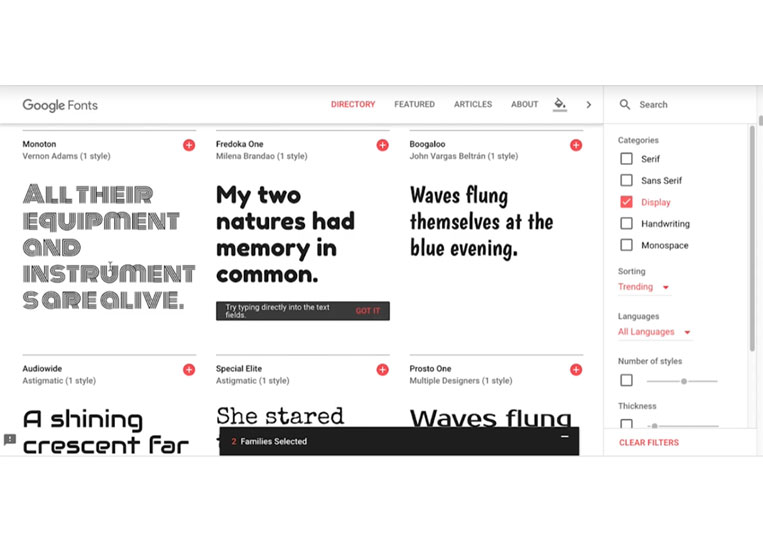
Probably not. But for a title, I think it looks pretty good. So as you can see, some of them look better than others, and there are a lot of fonts that you can use for free here.
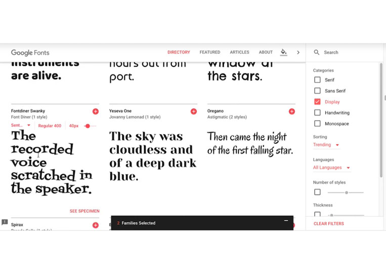
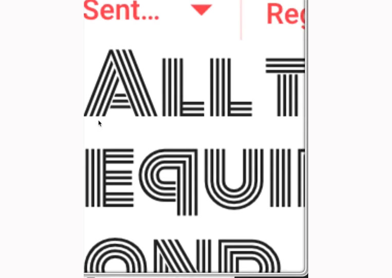
I think they’re all pretty good. And you know, some of them get a bit more abstract like this.
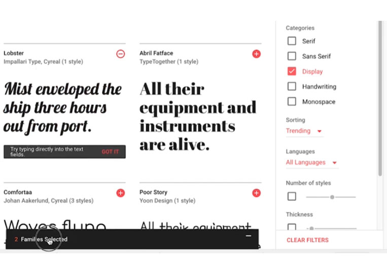
I think that’s actually kind of neat. There are a lot of these fonts here. One last item is that you can do a Display and Sans Serif fonts if you only want to mix those two.
Or Display and Monospace fonts.
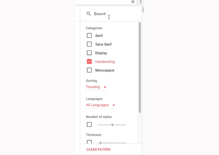
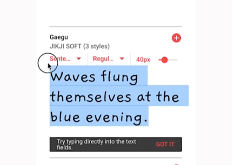
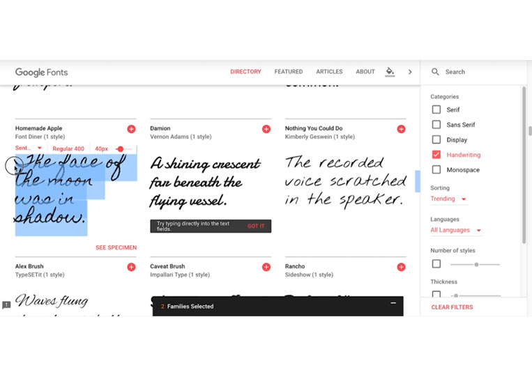
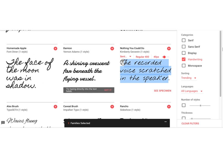
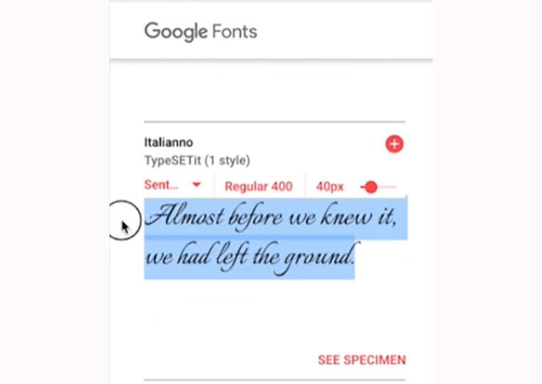
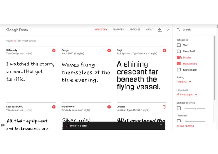
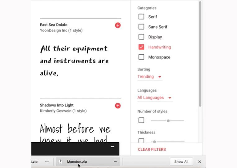
That’s a cool one. And lastly, we’re going to go with Handwriting fonts.
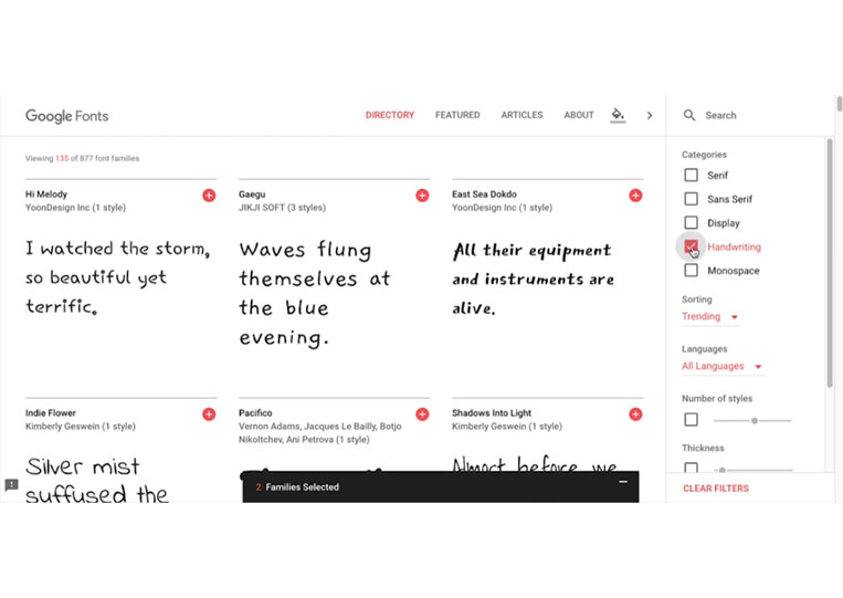
Now Handwriting fonts are probably the best example of making a font feel towards whatever your game is. So let’s say your game has that doodle feel like crudely drawn art.
It was a trend a little while ago. You might use a font like this because this font looks like a doodle font.
Now you can see that this one looks a bit scratchy when I go through it. Let’s say you’re making a game where you must follow these notes, and someone you know might not be there. Their frame of mind might be this font.
This one might not be as good as it’s pretty regular, but this one looks like it’s been scratched. Or let’s say you’re trying to find someone, and you know, like a game, we’re trying to find someone, and they’re in a hurry. And this could be a good font.
So those are the things you want to add.
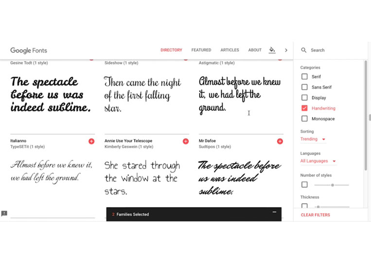
You’ll probably use this if you make a game set in the 19th century.
Because Handwriting fonts were more typical back then than it is now, and as you can see, there are always Handwriting fonts here. Of course, you can also choose Display and Handwriting fonts.
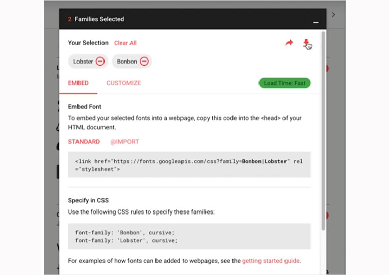
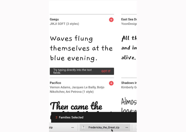
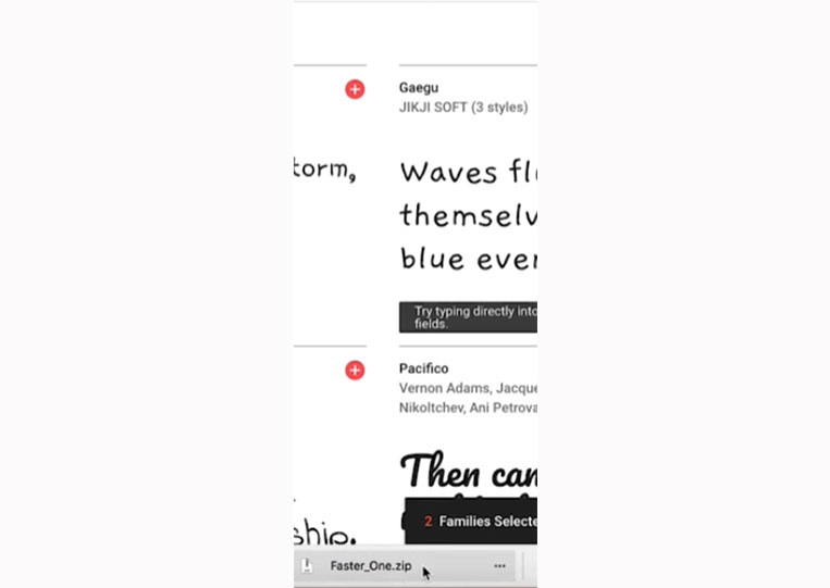
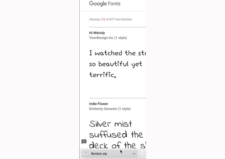
So let’s download a few fonts. I downloaded Monoton.zip, Fredericka_the_Great.zip, and Faster_One. zip and Bonbon.zip
You can also search for them here.