


Adding Variety
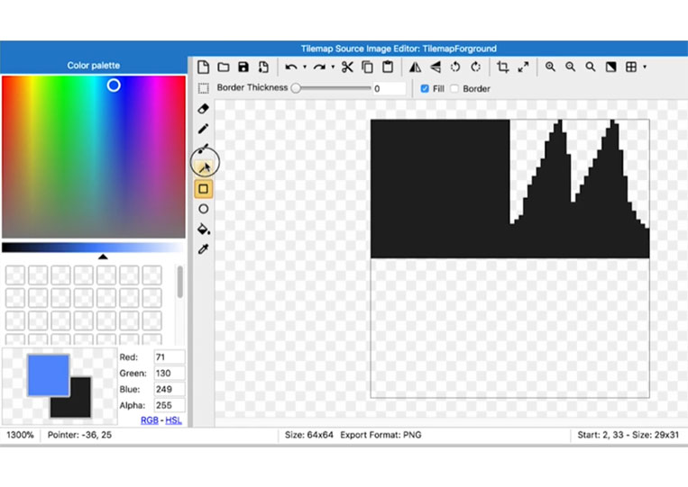
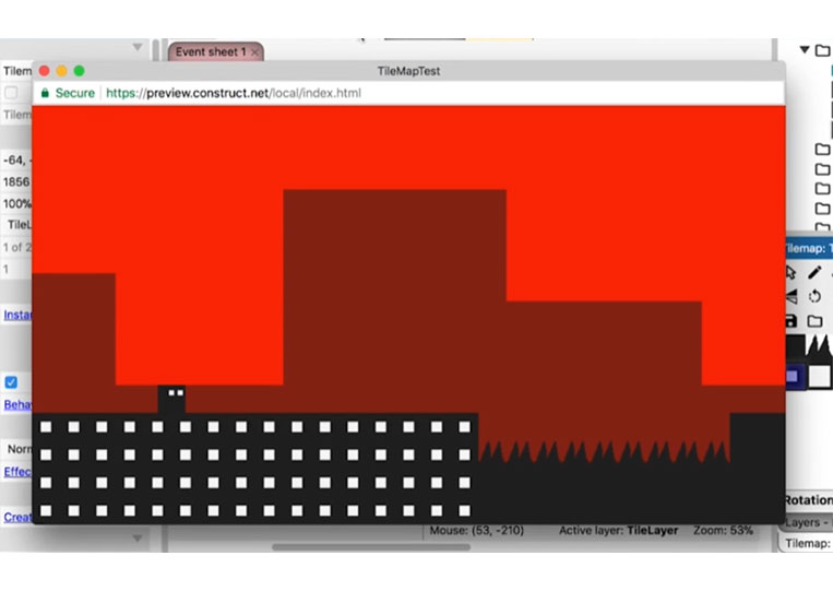
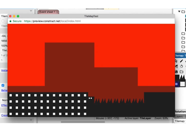
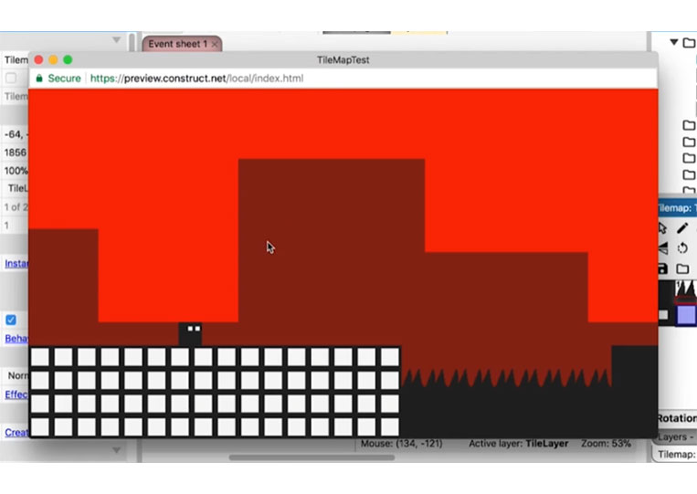
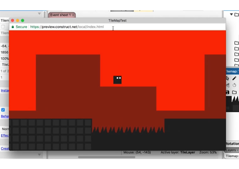
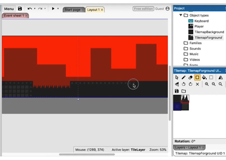
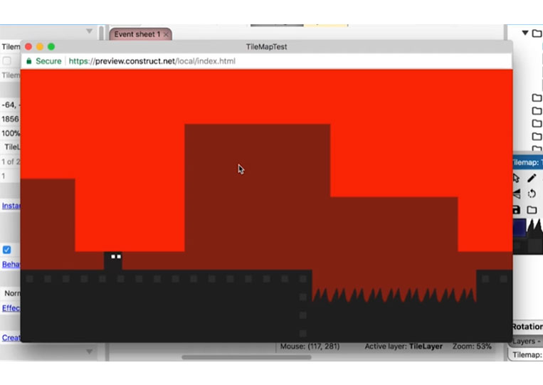
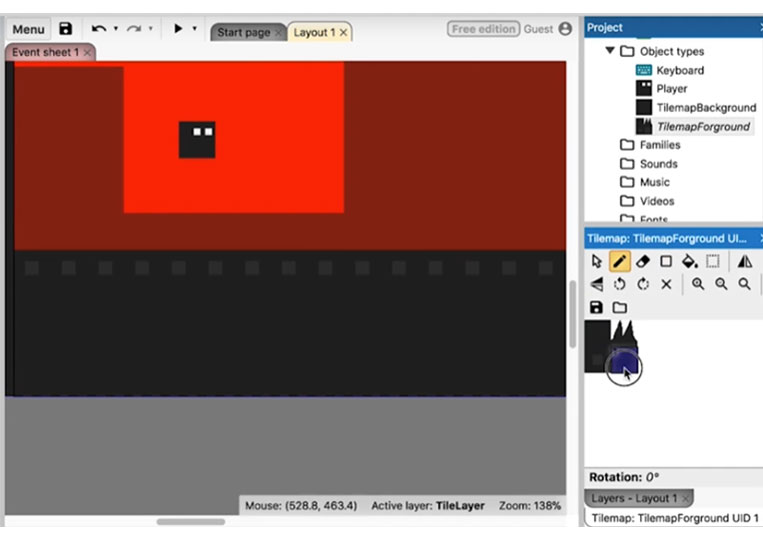
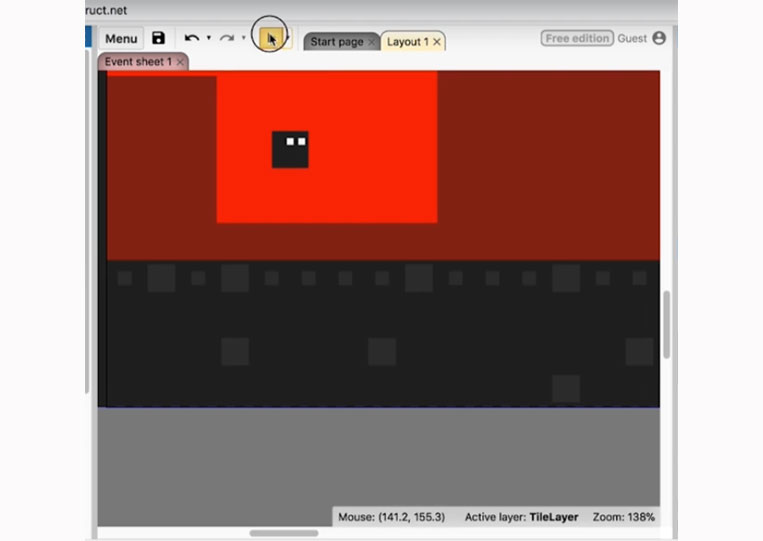
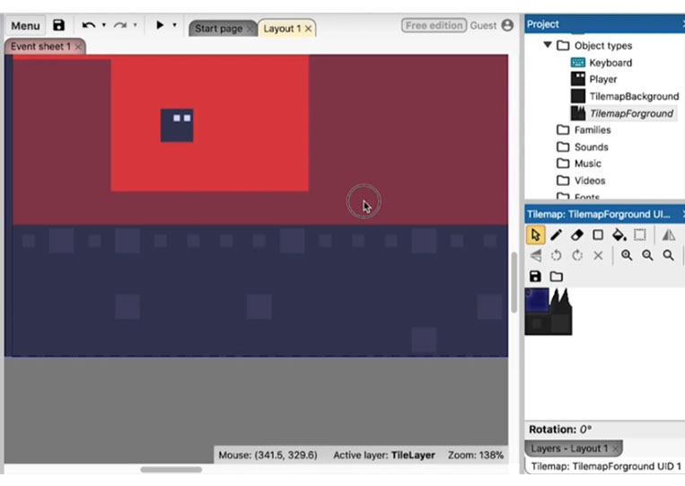
Regarding the tile map, we have something that looks nice but simple. So let’s see how we can make this a little better. So double-click on the tile map and expand it to two more tiles here.

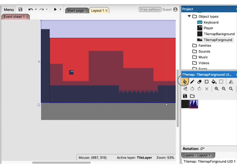
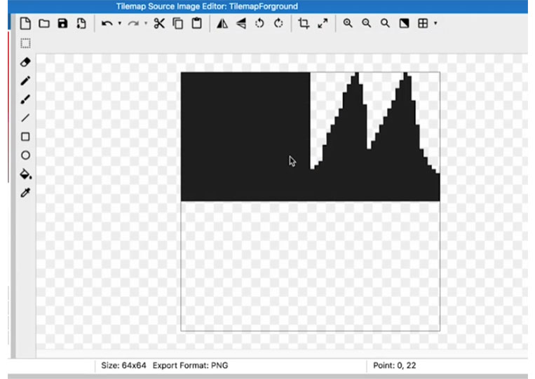
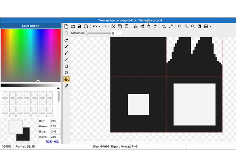
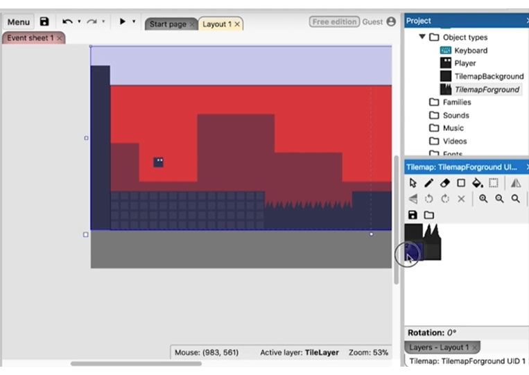
One of the things about the tile map here is the fact that the squares work well together. And so if you do that, you can make squares, for example, something that looks like this, which will look pretty good when you tile them.
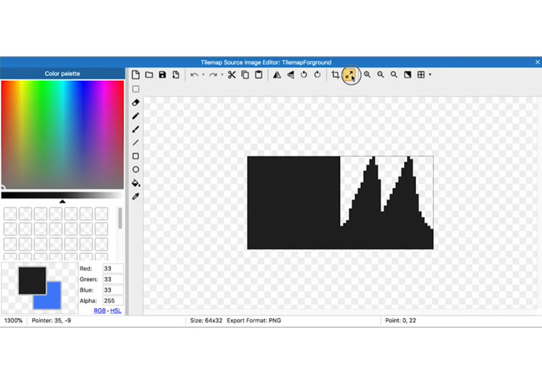
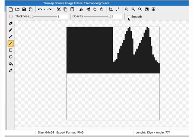
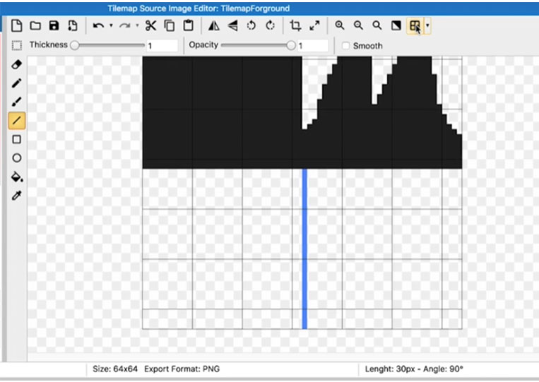
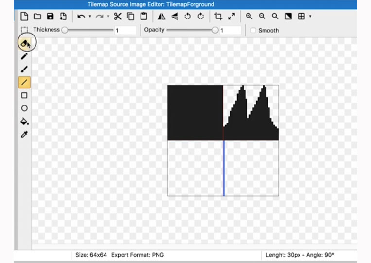
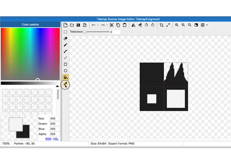
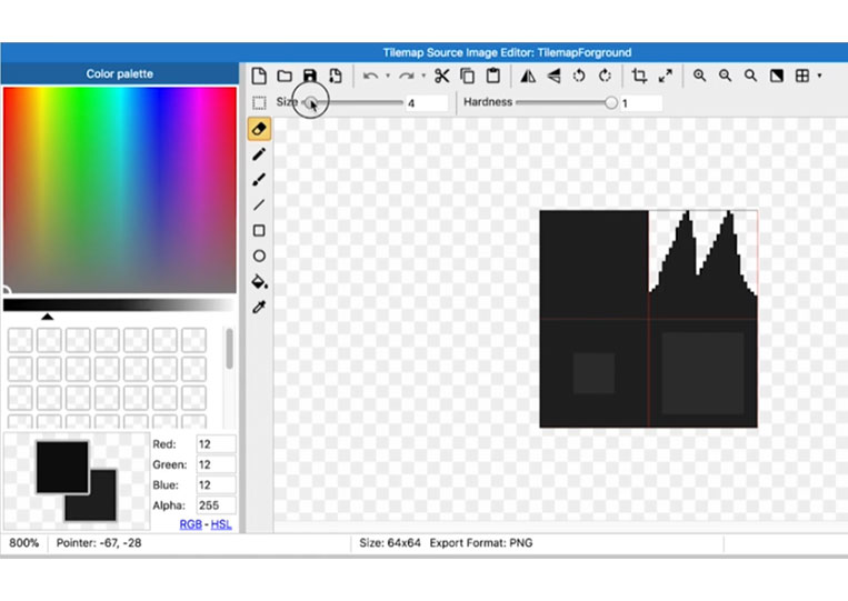
First, I’ll make a line here. I want the thickness to be one, and we don’t want it smooth.
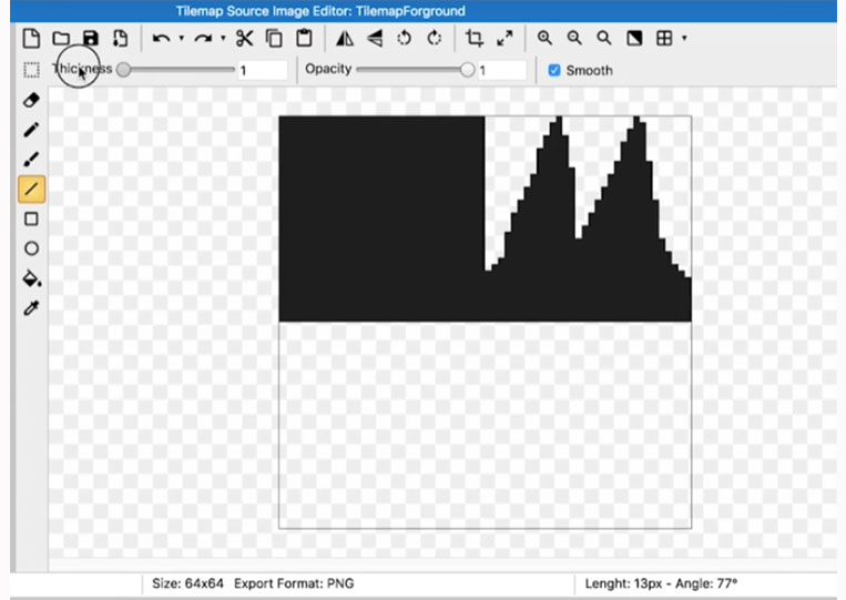
So zoom in, and I’ll drag a line down there.
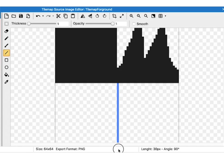
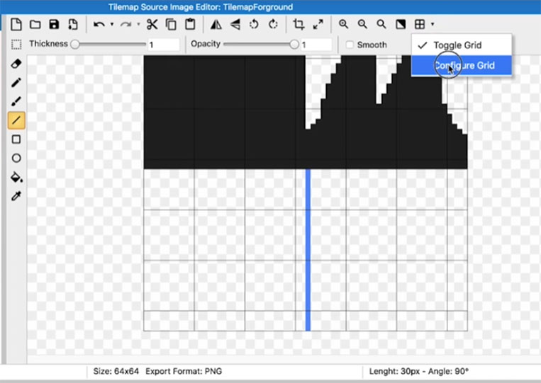
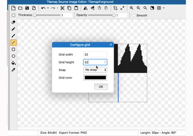
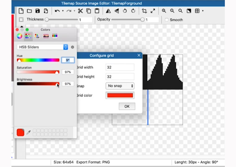
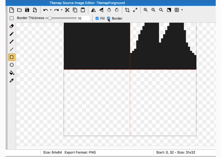
You can toggle the grid and set it to 32×32.
You can give it a nice red color.
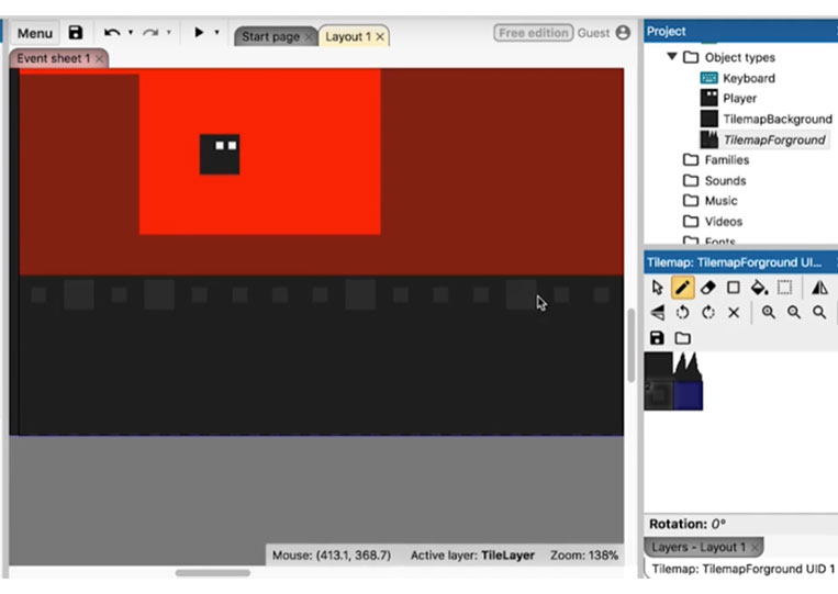
And that way, you don’t necessarily need this line here. You know exactly where everything is. So let’s remove that line.
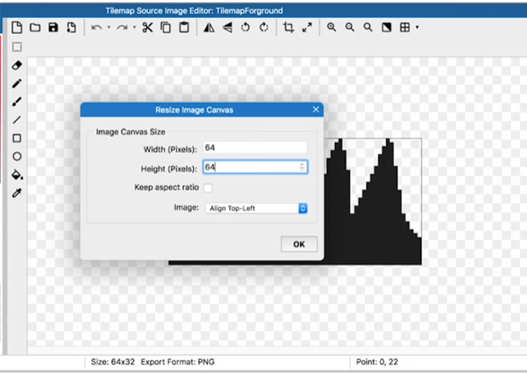
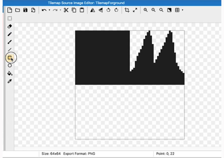
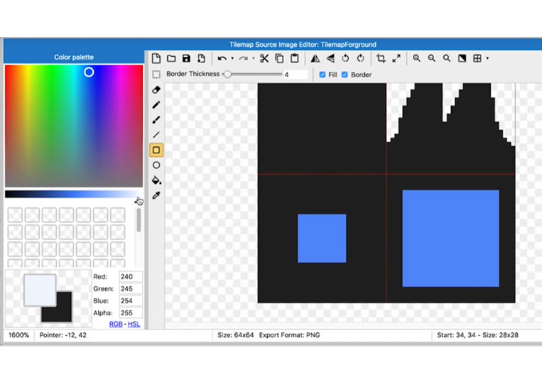
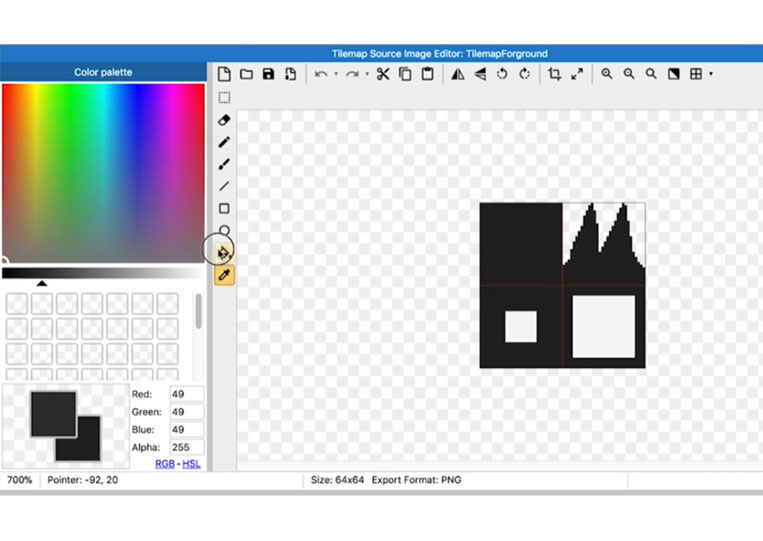
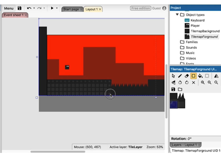
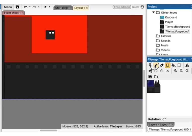
See how to create a square here.
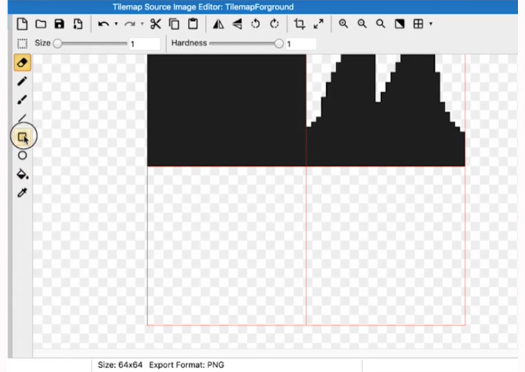
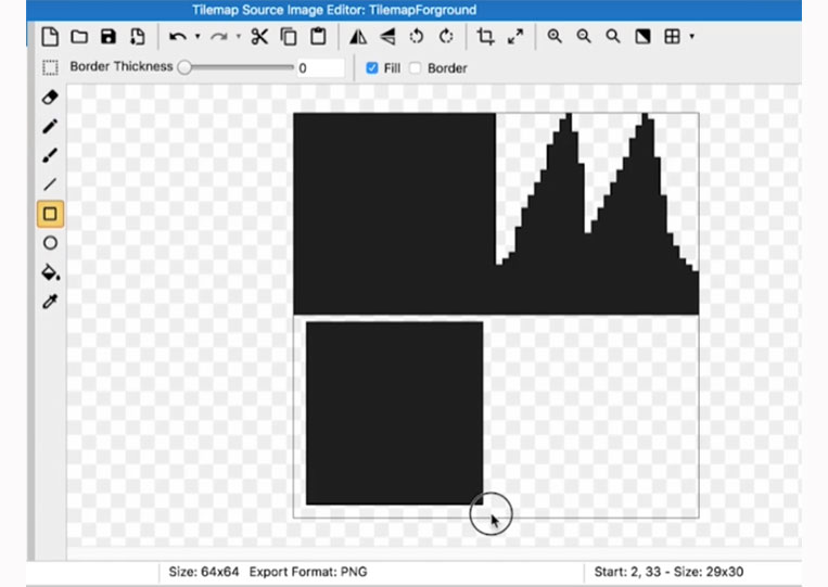
Now I add border thickness.
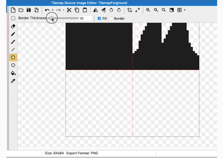
And I also add a border.
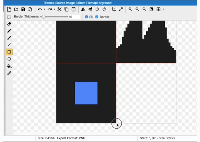
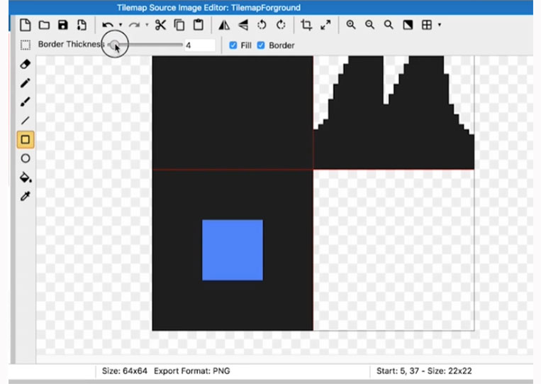
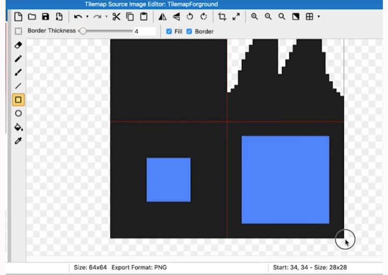
And you can see that we now have a square by adding this border. We’re going to play around with the square in the middle. So change that border to maybe half or less than half and do the same for the rest.
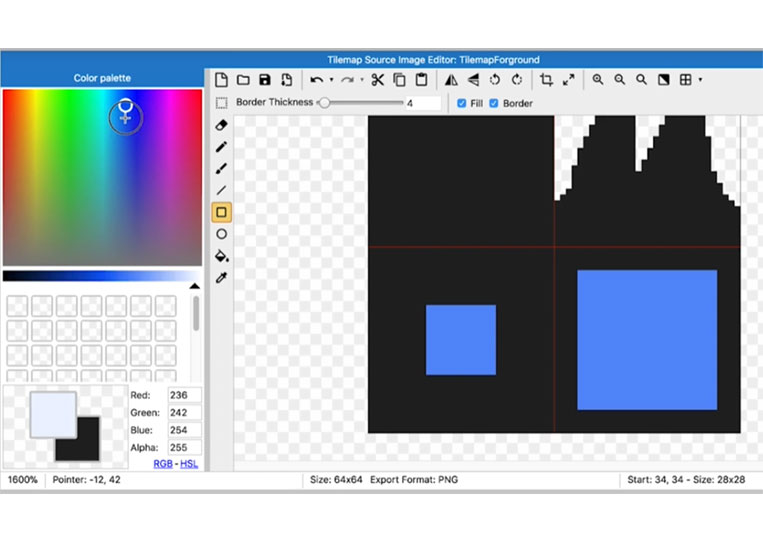
Just drag it over there, and you want to ensure your margins are the same.
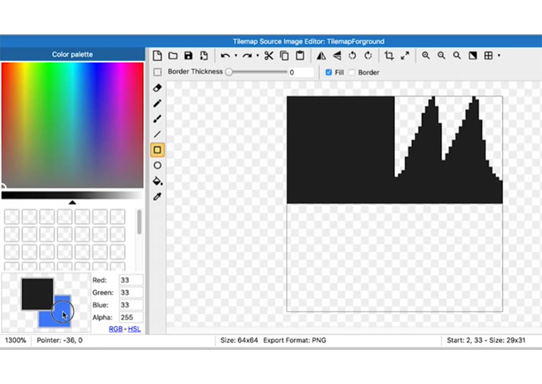
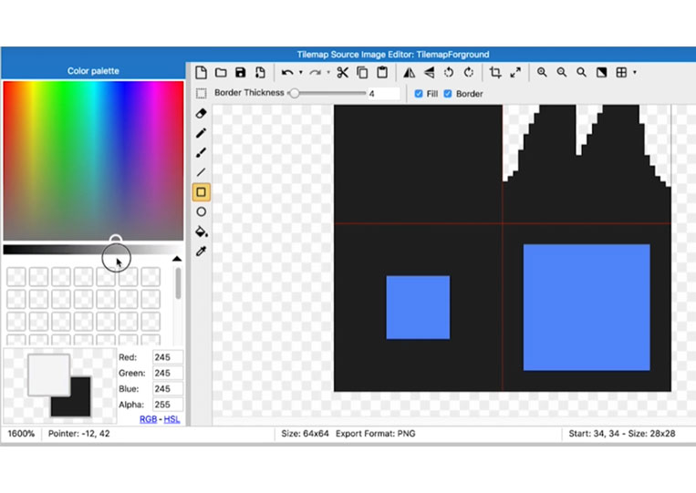
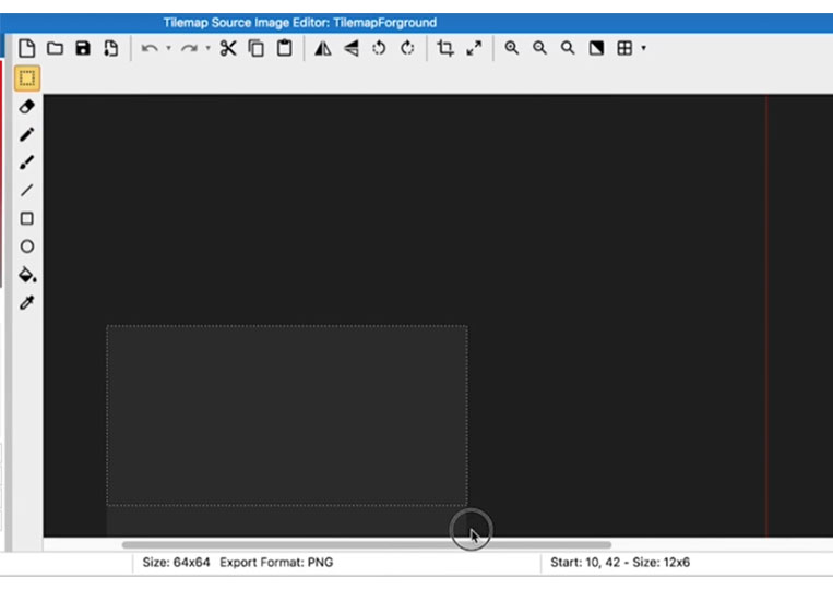
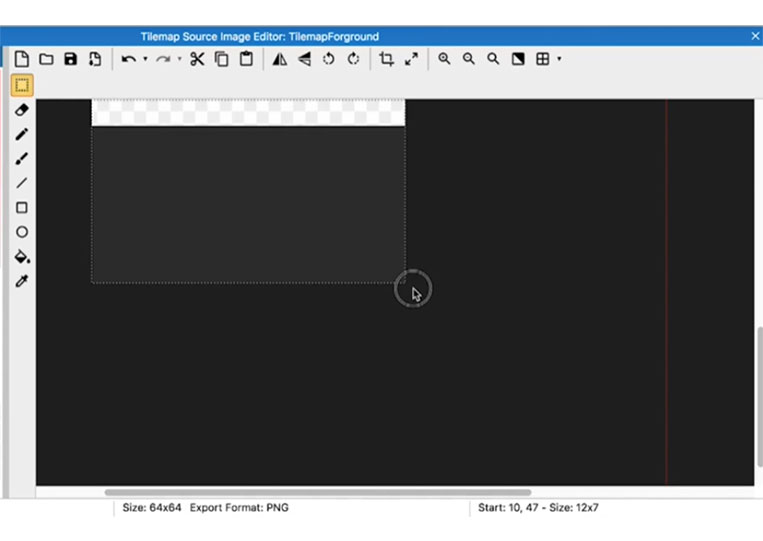
Here, we can use those two options with this square: make it white or delete it. So I will make it white first.
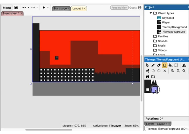
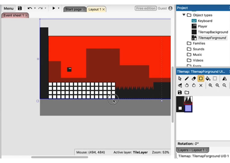
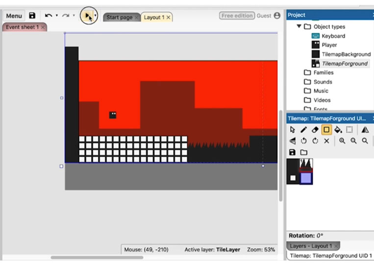
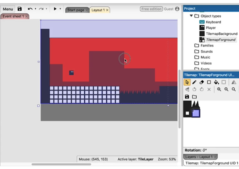
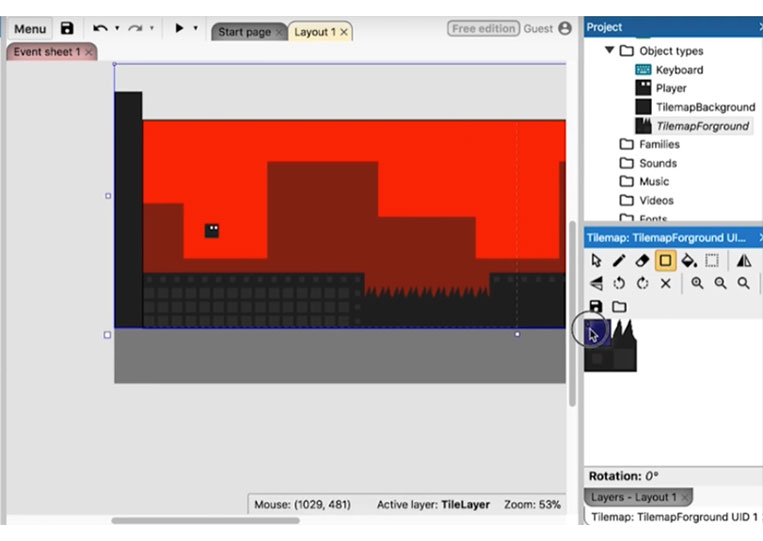
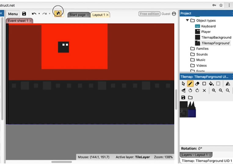
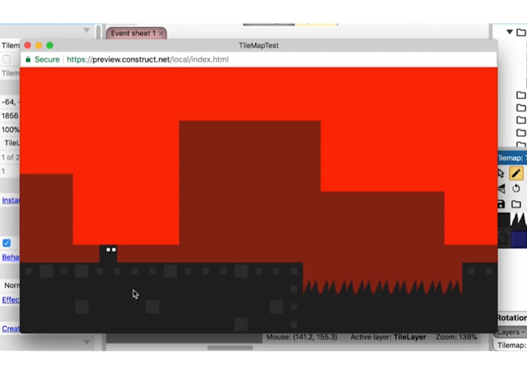
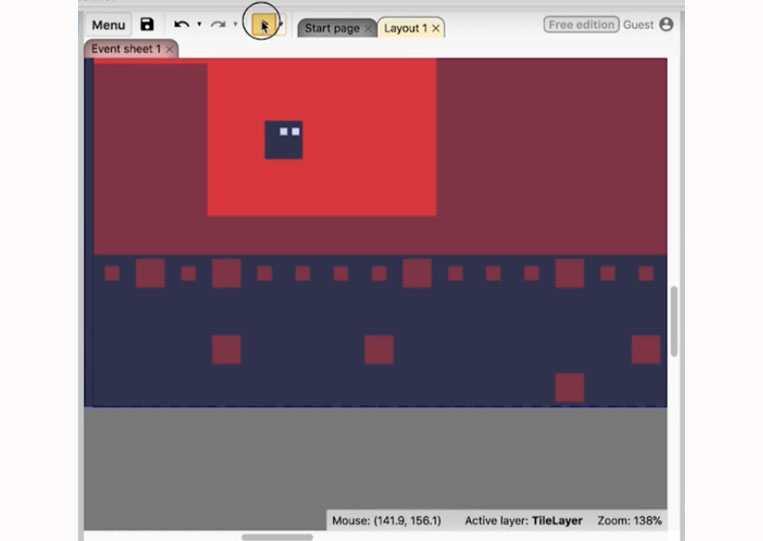
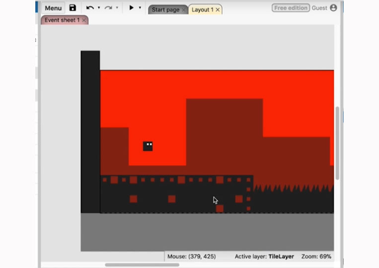
I’m just doing that. So close it and then play around with the tile map here.
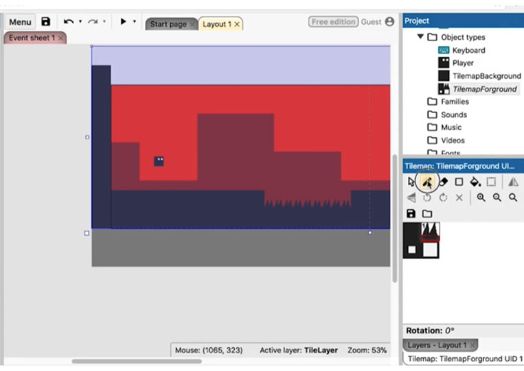


If you look at it, it will look a certain way.
It looks no different. We do the same thing here.
We’ll play with everything here, but I want to ensure it renders appropriately.
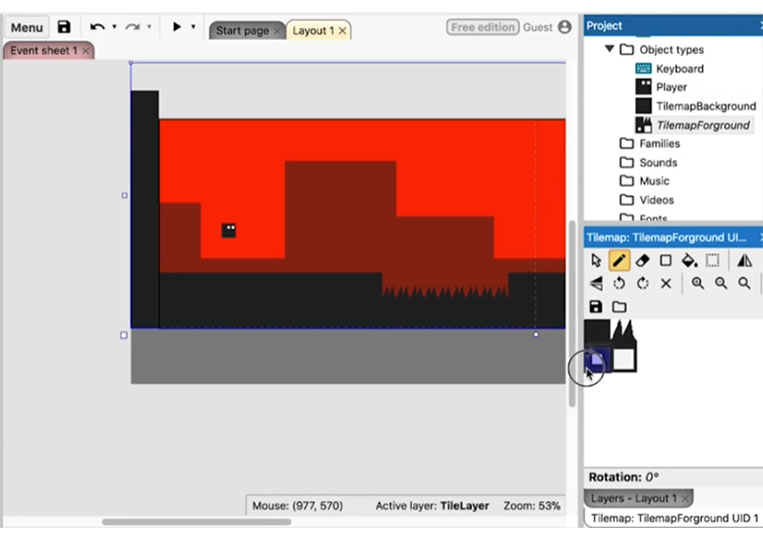
Now, as I said, you can do a lot with this. Maybe white isn’t the best idea at all.

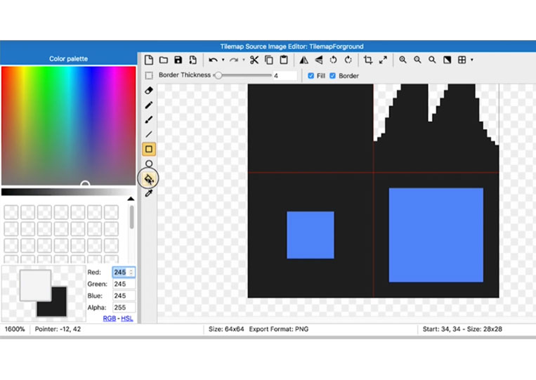
We will use the Eyedropper tool and change it to light black.
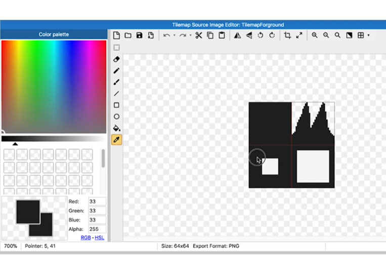

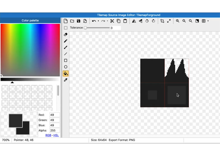
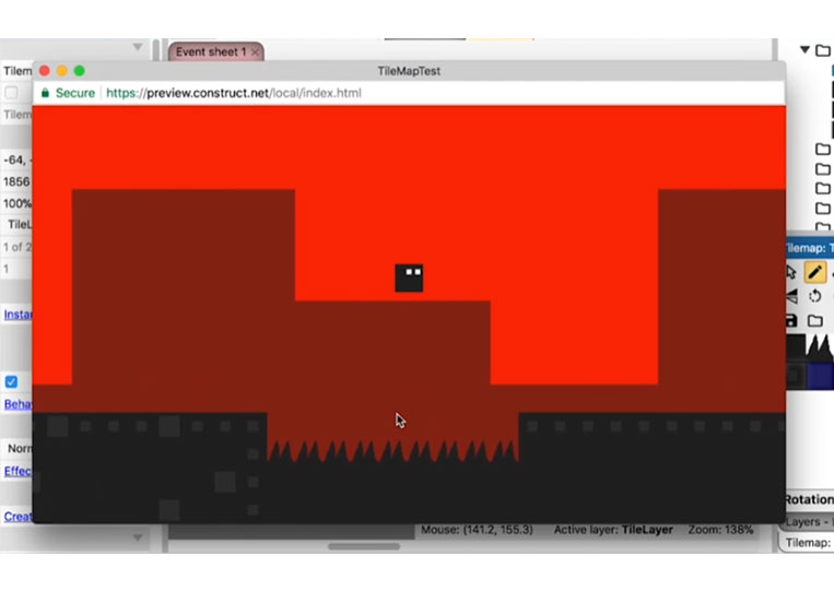
You can see that it looks a little different now.
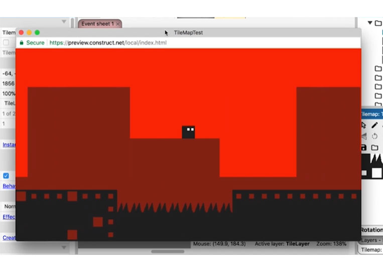
But when you add these squares like this, it’s an easy way to differentiate.

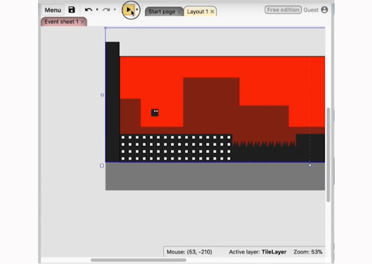
You don’t always have to make everything the same. You can cause, for example, the top one and then add the rest to the bottom like this.
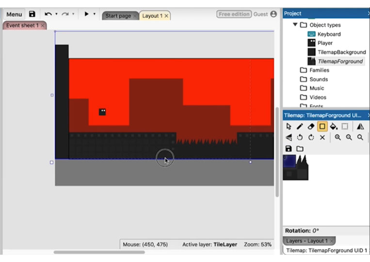
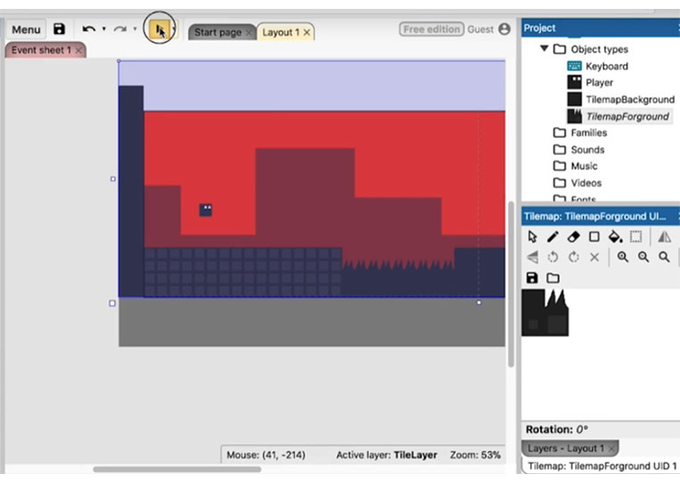
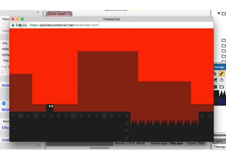
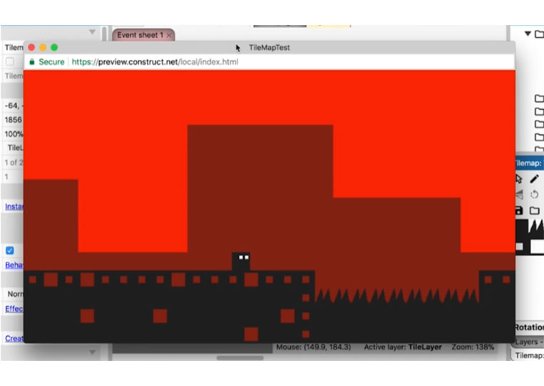
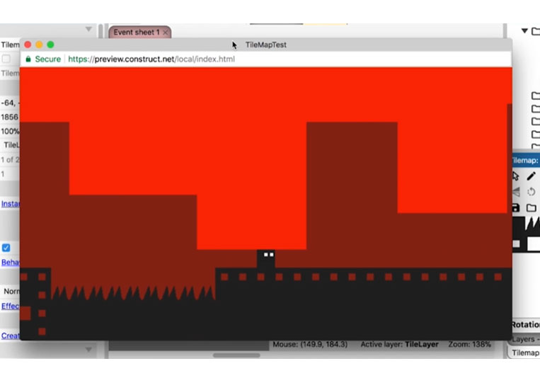
Now let’s look at how it is.
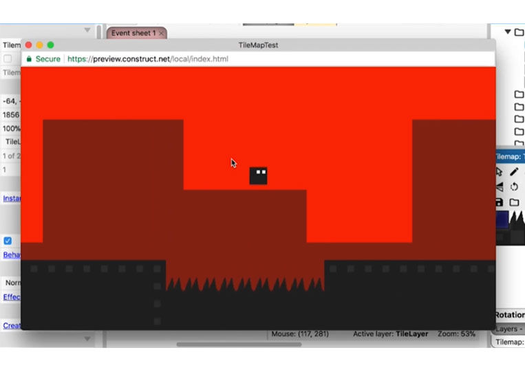
It does add quite a bit. In theory, you can mix and match like this as well.
Here’s a little bit different from it, but you can do that.
You can also mix and test random elements.

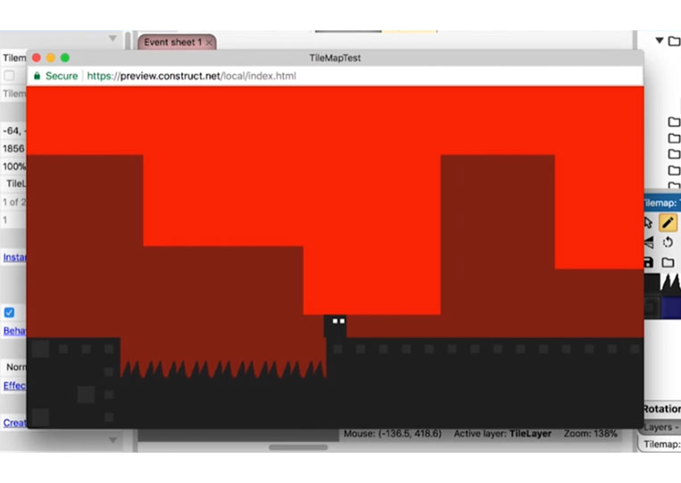
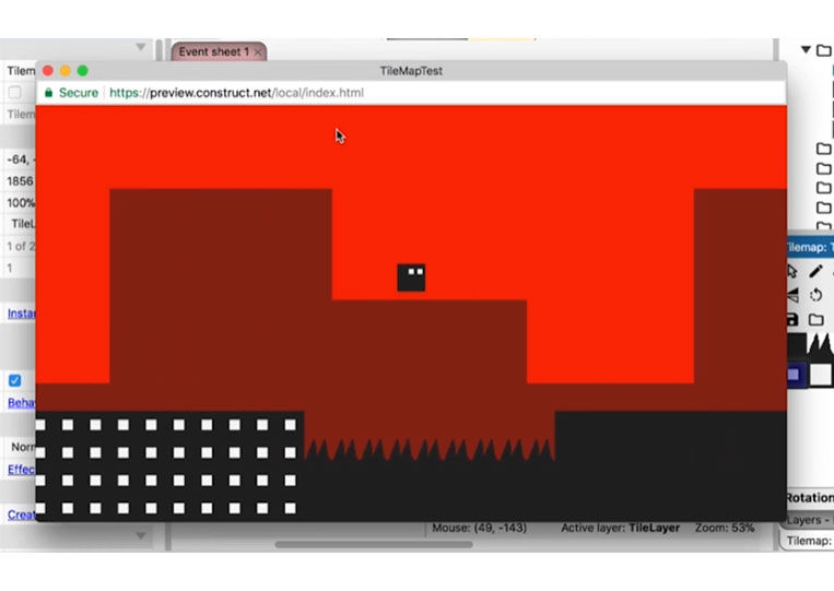
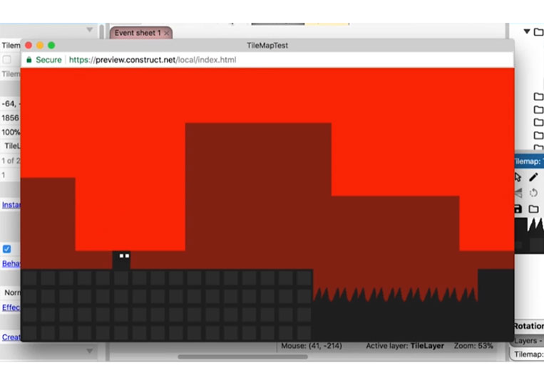
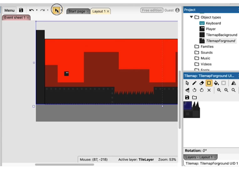
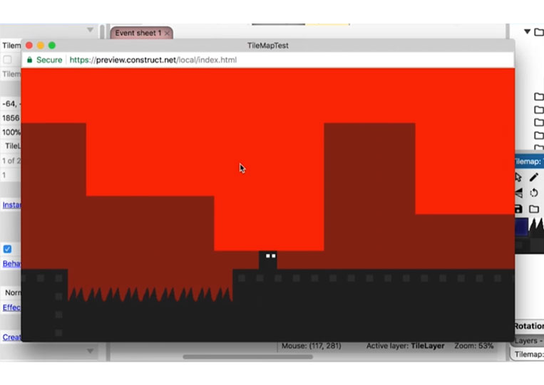
And as you can see, adding a few squares makes it look a little different; of course, it’s completely different from just adding silhouettes. You can see that the silhouette is different. Whether or not you think that extra detail will work is up to you. Now let’s move on to the last item, which I will delete.


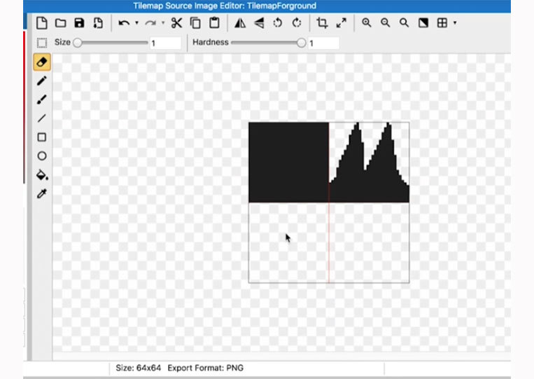
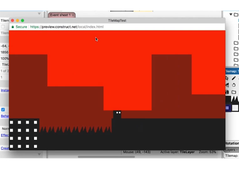
I will erase the area here. I put the size back down to four.
And you can delete it like this.
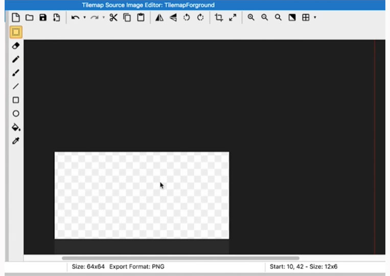
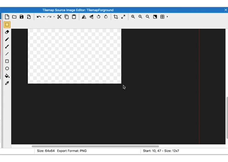
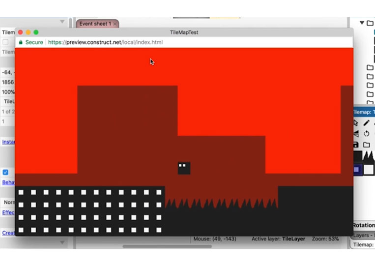
Now the pixel editor is pretty good in Construct 3, but occasionally I wish for other tools I have in Photoshop. It might take a bit, but I think we got all of it right there. Now the last thing you can do is completely take it out, which I like to call negative space.
Now, this, in my opinion, looks the best. And what I like about it is that it doesn’t add any extra color or anything like that.
And I think it looks the best. It also adds to the minimalism here. So this does look pretty good. And you can see that that little extra work makes the game look better. You’re welcome to take a look and make more of these tiles if you want.


